Note: this guide is a work in progress and may change at any time! We’ve done our best to cite our sources, but this page has not been professionally fact-checked.
This workshop was first run as part of two pilot workshops with the Tech Equity Coalition in partnership with the ACLU of Washington in October 2019. It was next run at the CtrlZ.AI zine fair in Barcelona in February 2020. Most recently it was run online for the Tech Equity Coalition in July 2020, co-facilitated by a leader of the Council on American-Islamic Relations Washington (CAIR WA).
Facilitators: 1 to 2, plus 1 per breakout group if conducting digitally
Group size: 5-25
Time: 60-90 minutes
Recommended Location: see In-person vs. Digital section for specifics
Introduction
Surveillance is a complicated topic. We are surveilled by a host of private companies, government agencies at levels from municipal to federal, in physical and digital space, and by a staggering range of technologies.
This workshop has been designed to be useful for individuals who feel overwhelmed by this complexity, and might have questions like “how does this affect me?” or “what should I be most worried about?” It can also be a useful framework for understanding what interventions might be effective in protecting you or your community’s privacy.
The following is a facilitator-facing guide for starting that process. It uses stories and mapping as the primary vehicles for uncovering and categorizing entities and for tracing the flow of information. All of our stories are plausible narratives that we wrote based on actual technologies or events reported by reliable technology journalism organizations. (So, while a story may not have literally happened, it very plausibly could have happened, in our opinion.)
In-person vs. Digital
This workshop has been run successfully both digitally and in-person. Below are material and space requirements for both versions, as well as some tips and tricks.
In-person
In-person versions of this workshop are engaging, and generate conversation and great material evidence for participants and facilitators alike.
Material/space requirements
- Printouts* of map & story, 1 per participant, ideally of the size 11×17″.
- Lots of colorful markers, pens, pencils, etc. At least 5 different colors.
- 1 large format B+W print* of map, 24×36″ or larger. Fedex + UPS stores sell prints of this size for about .
- Screen/projector for presenting slides. To edit the agenda/structure, you can duplicate them (File > Make a copy > Entire presentation)
- Tables + chairs. Ideally small tables to allow for easy break-out groups.
*Contact us if you would like PDFs of these materials.
Digital
This workshop can be engaging and unique in a digital format. We recommend you use Zoom for the workshop itself, or any other video conferencing service that allows breakout rooms (if more than 5 participants) and screen sharing. Unfortunately, while still possible, the act of highlighting the stories and drawing connections is somewhat fiddly. See the Mapping! section for specific advice if conducting this workshop digitally.
Google Slides allows for live editing, which can be used in lieu of highlighting and drawing connections. Here is a link to the slides. You can duplicate the slides (File > Make a copy > Entire presentation) to edit the agenda or structure as you see fit.
Agenda
This agenda is flexible upwards (up to 90 minutes) but trying to fit it into less than an hour means that certain sections will be rushed, or the discussion components will be lost.
- Getting Comfy, Introductions, Acknowledgements: 5-15 minutes (slides 1-2)
- Context + Goals: 5-10 minutes (slides 3-4)
- Map Overview: 5-10 minutes (slides 4-12)
- Mapping Example: 15-20 minutes (slides 13-17)
- Diving In! 20 minutes (slides 18-40)
- Discussion/Conclusion: 10+ minutes (slide 41)
Getting Comfy, Introductions, Acknowledgements
5-15 minutes, slides 1-2
This section is to allow for latecomers and to let everyone get settled.
Introduce yourself, let any other facilitators introduce themselves, and thank the organization/space that is hosting you.
If there is time, let the participants introduce themselves with their names, pronouns, and an answer to an icebreaker question, such as “what has brought you here today?” or “what is the best meal you’ve eaten this week?”
Other ways to use this time are an acknowledgement of current events, a land acknowledgment, or small talk and catching up.
Context + Goals
5-10 minutes, Slides 3-4

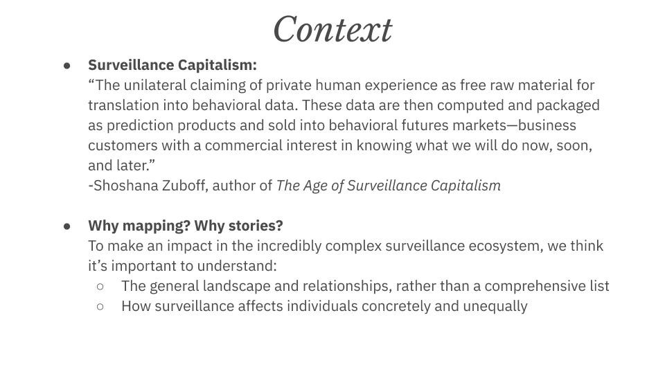
We’ve started this section with a quote from Shoshana Zuboff, which we believe is a good framing of why surveillance is such an important topic. Feel free to choose other quotes or pieces of content that you think will be particularly compelling for your audience.
Why Mapping? Why Stories?
You can read this statement word-for-word, or go into more detail by referring to the Introduction section of this page. Further discussions or examples of mapping can be found in the work of William Powhida, The Greater Boston Anti-Displacement Toolkit, and Ed Simon, to name just a few. These links are not necessary for facilitating this workshop, but they do provide some helpful context.
Who’s being watched
This is a segue into the next section. It is also an acknowledgement that surveillance affects us all differently. While not an immediate concern for some privileged individuals (“I have nothing to hide”), surveillance is a force that can further the oppression of marginalized groups.
Map Overview
5-10 minutes, slides 4-12

This section is necessary because the map, just like the surveillance ecosystem, represents an overwhelming amount of content when viewed in its entirety. As a result, the slides are designed to create a build, where you can speak to the various sections that make up the surveillance ecosystem, and by the end have a shared understanding with your participants about the categories and structure of the map.
This section is a good example of how two facilitators are advantageous. By switching off, slide by slide, the content can feel more conversational and less like a lecture.
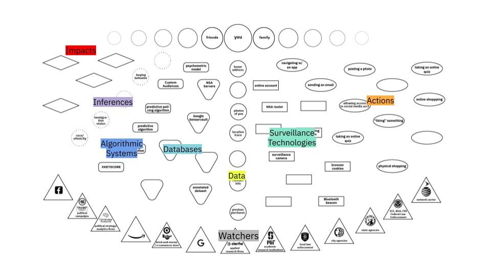
These categories of the map are as follows:
- Who’s Being Watched (slide 4)
Surveillance happens to everyone. The data we give up also reveals information about our friends, families, co-workers. - Watchers (slide 5)
These can range from government agencies (ICE, NSA) that use surveillance as a key part of their process, well-known technology corporations (Google, Facebook) that make it part of their business model, municipal agencies (local police) that benefit from data sharing, and contractors (Taser, Clarifai) that develop key surveillance technologies. - Actions (slide 6)
Shows the wide variety of actions we take in physical and digital space that can be surveilled. Shows both the broad distribution of surveillance tech and which actions are particularly risky. - Surveillance Technologies (slide 7)
Hardware and software that collects information about us. Can exist in physical space (surveillance camera) or digital space (browser cookie). Especially nefarious if it exhibits dragnet behavior, collecting information indiscriminately. - Data (slide 8)
The information that is collected by surveillance technologies. Can individually identify us (such as our name, biometrics like our face, or our address), or might be aggregated and subject to inference from third parties. - Databases (slide 9)
Collections of data held by watchers. Access to these can be sold by data brokers or tech companies, or opened up to government agencies with warrants or subpoenas. - Algorithmic Systems (slide 10)
Uses large amounts of potentially biased data to make… - Inferences (slide 11)
Guesses made by algorithmic decisions. May or may not be correct but can have… - Impacts (slide 12)
Results of the surveillance society + economy on individuals.
Many of these boxes are left open, because it is impossible to map all examples of all of the following. Some are filled in to help the process of mapping, but it is greatly encouraged that participants fill in boxes during the mapping process.
For more information on how to specifically identify or analyze some of these categories, please see the Algorithmic Equity Toolkit.
Mapping Example
Now that the map has been introduced, it is time to give a quick tutorial of the mapping process. Because this is a content-rich workshop, it can be useful to read the room and gauge how much haste and/or participant interaction would be useful at this stage.
Storytelling
Read the story in your best stage voice. Don’t interrupt yourself with commentary, and focus instead on giving it some pacing and intonation that will help the participants simply enjoy the telling. The following story has been annotated with an example of what that might sound like: (italics are emphasis, ellipses “…” show a long pause)
What’s The DiFference?
Click. That’s a good one! Your mom is actually smiling, and your dad didn’t blink. Your sibling looks great, but they have always been photogenic… This has been a great day of good photos, and at the end of it your mom (of course) wants to know where she can see them. Being an amateur professional photographer, you upload all of your best pics to Flickr, but because this is just a hobby you have them accessible on a Creative Commons license…Which is just the license an IBM researcher is building into her web scraping algorithm…With the algorithm, she is able to add a huge amount of images to the Diversity in Faces (DiF) dataset, which is made with the intent to make facial recognition fairer… The picture of your family is annotated, correctly identifying your mom and dad’s age and gender, but enforcing a gender binary onto your sibling… The annotations also identify the skin colors of your family. Using this dataset, which is accessible to public and private research institutions, an applied research firm develops a facial recognition for the NYPD, with the intent of searching for people of a specific age or skin color…
Highlighting
Now you will show the process of breaking the story into the categories that makes up the map. For both Digital and Physical workshops, it will be most visible for you to do this live in Google Slides with the Highlight function:


Choose the color that corresponds to each category. Slide 15 contains our key, but we encourage you to do this process on your own as well. The correct answer is less important than the act of analysis!
If you have enough time, you can explain your rationale for some categorization, or ask briefly participants to volunteer answers for certain sentences:
“There are a couple mappable entries in this sentence. Can I have a volunteer tell me what they think they are?”
Mapping
After the categorization has been done, trace the data flows from component to component through the map. For the components that are missing from the map, fill them in the blank shapes that correspond to that category.
If you are doing this physically, do this with a marker on the large format map. If you are doing this digitally, you can do this on slide 16, using the arrow tool and text box tool in Google Slides.


Move through this section as quickly as possible, as the fun part comes next….
Diving In!
20 minutes, slides 18-40
Based on your group size and format, break the participants into groups of 3-5, Tell them which story they will be working on and when to return back to the main group.
If you are conducting this workshop digitally, it is a good idea to have a pre-chosen facilitator for each working group. Decide which facilitator corresponds to which story beforehand. Here is a guide for those facilitators.
The process for breakout rooms is as follows:
- Participants introduce themselves briefly.
- Ask two participants to volunteer as readers.
If conducting this digitally, the facilitator should share their screen and navigate to the slide that corresponds to the story that group is working on. - One reader reads the story from start to end in their best stage voice.
- Collaboratively, the group decide which components of the stories correspond to which categories on the map. If doing this physically, have them use the different color markers/pens to annotate them. If conducting this digitally, the facilitator should highlight the components in the Google Slides.
- Following the continuity of the story, trace arrows, using just one color, from component to component in the story, filling in the ones that are missing.
- At the predetermined time, the groups will come together and share out their results.
When back in the main group, go through the stories in order. Put the story that is being read up on the screen (or screenshare).
For digital workshops: Ask the readers for the group to alternate reading the story out loud, showing the highlighted version and map briefly, and sharing 1-3 insights or questions that came up in the process. Examples can include not being sure how to categorize a story component, noticing a pattern in the data flow through the map, or sharing a (short) related anecdote that they may have come across previously.
For physical workshops: Ask the readers to read the story, and come up to the large map and draw data flows and add missing components, using a different color for each story. Ask them to share out 1-3 insights or questions that came up in the process. Examples can include not being sure how to categorize a story component, noticing a pattern in the data flow through the map, or sharing a (short) related anecdote that they may have come across previously.
Discussion/Conclusion
10+ minutes, slide 41
This section tends to emerge organically from the share-out. The following are four broad questions that we have written, but we invite you to write your own to specify it for your audience or intent.
- Did the stories fit neatly into the categories?
- What patterns in data movement did you notice?
- What stories should we be mapping?
- How do we stop a data flow?
Appendix I: Stories & Sources
The following is all stories we have currently written and their source(s). All of the components we recommend you map are bold and italic. See the slide deck key for each slide for specific categorization, but please keep in mind that there is no one “right answer” for categorization.
It’s also worth nothing that the technologies and topics surrounding surveillance are rapidly developing and unequally distributed. New stories are sure to emerge, so some of these stories might be become out-of-date. For this reason, this workshop has been explicitly designed as a framework for dissecting any story. If you are aware of a more recent or more topical story when deploying the workshop, we absolutely encourage you to try it out using this format—and let us know how it goes!
No. 1: Buzzfeed Quizzes vs. Democracy (slides 18-19)
While thumbing through your Facebook feed, you see your friend is a French fry, according to a Buzzfeed personality quiz. Curious to find out what type of potato you are, you click on the quiz, click through the page that allows Buzzfeed to access your profile, and take the quiz. You are a tater tot, and you let your friends know. Meanwhile, Buzzfeed remembers your answers, and has also gained access to parts of your private profile (which may include your likes, photos, and friends). They aggregate this data with other users’ information and sell it to Acxiom, a third-party data broker, who turns around and sells it to Clarity Campaigns, a data analytics / political strategy company similar to Cambridge Analytica. Using this data, Clarity Campaigns builds a psychometric model of voters who are likely to be swayed by a well-placed Facebook ad. They help the Bernie Sanders campaign build a digital marketing strategy to target just those types of people using Facebook’s Custom Audience system. Your phone pings, and you see that someone liked your tater tot results. Just beneath that, you see an ad for the Bernie Sanders campaign that is oddly compelling. You keep scrolling.
Source: Vice, The Data That Turned the World Upside Down (Jan. 2017)
No. 2: Very Public Health (slides 21-22)
Cough, cough. Uh oh. You’ve been feeling some symptoms of the infamous coronavirus. Luckily, your city has a rigorous test and trace program. You get tested and…yikes! the result is positive 🙁 Your country’s department of health mandates that you hand over your cell phone so they can view your location history for the last few days, and alert any possible contacts. A professional contact tracer also asks you for your social media accounts, text messages, credit card statements, and public transportation records. The government promises anything they publish will be anonymous, but they broadcast an alert that includes your age, county, workplace… and the beloved LGBT bar that is a central gathering point for your community. Your neighbor texts you, saying that the alert sounds like you. Luckily, you have already come out to her…but if she could deduce your identity, who else could? Your ex? Your parents?
Source: Time, How South Korea’s Nightclub Outbreak Is Shining an Unwelcome Spotlight on the LGBTQ Community (May 2020)
No. 3: A Dragnet the Size of the Internet (slides 25-26)
You attend a Black Lives Matter protest, coordinating on a group chat with your Google Pixel to your friends so you don’t go alone. A manhunt ensues after the protests because a warrant is issued for protestors who broke windows in the downtown retail stores. A detective with the city police department files a “Dragnet” warrant to Google for location data associated with the stores. Google combs through its Sensorvault database, and sends anonymized location traces that match the time and place. Your location trace is an especially good match, and Google reveals your name. Detectives view your Facebook account and see you are a regular organizer in your community. Your name is added to a list of suspects for inciting a riot.
Source: The New York Times, Tracking Phones, Google Is a Dragnet for the Police (April 2019)
No. 4: Target Knows You’re Pregnant (slides 29-30)
You get pregnant. It’s understandably a scary and exciting time. You still live with your Puritan parents, and they would NOT be happy if they found out. As a pregnant person begins to do, you start searching for and ordering the usual things: unscented lotion, mineral supplements, and cotton balls. Because you still live with your parents, you are cost-conscious, buying each item on the site where it is cheapest. You buy the mineral supplements at Target because they are having a sale, and because you can do in-store pickup to keep things hidden. But buying something at Target means you are now part of their customer database, and your purchases are associated with your “Guest ID.” And buying something at Target using your credit card means your address is now on file. Target uses powerful predictive algorithms to look at your purchases to predict possible future purchases. In an attempt to capture your future purchases, they send a “Congratulations on the baby!” postcard, as well as a coupon for “Goodnight Moon,” to the address on file, which is your parent’s address. D’oh!
Source: Slate, What’s Even Creepier Than Target Guessing That You’re Pregnant? (June 2014)
No. 5: Studded Black Leather Surveillance (slides 33-34)
In your small town, the mall is still a great place to hang out. You are walking with your squad when a pair of studded and shiny boots catch your eye in the window of the Doc Martens store. You pause for a moment. You’ve been looking for a pair of new boots… and a small plastic puck hidden in the door mantle notices, pings your device, “sees” that you paused, and collects your MAC address…. but your friend grabs your arm and hurries you along before you can walk in. Luckily (for them), Doc Martens already has your MAC address on file, because you clicked on an Instagram ad once. Doc Martens’ predictive algorithms know to send even more ads to people, like you, who have paused outside their stores. This time, they advertise their latests boots – the ones that made you pause. You recognize them in the ad, and buy them. Doc Martens’ advertising teams see that the beacon helped make that sale, and begins installing them at every touchpoint they can get their hands on.
Source: The New York Times, In Stores, Secret Surveillance Tracks Your Every Move (June 2019)
No. 6: Just @ Me Next Time (slides 37-38)
You’re finally getting around to writing your thesis. You email your very patient advisor, asking their opinion about a paper you are considering citing. You had no clue, but the author of the paper, now living in Tunisia, is a whistleblower taking refuge from your government, and they are on the NSA’s target list. Your email, travelling on a Sprint network, passes through an AT&T peering center—which is tapped by an NSA router. The router automatically flags your email because it contains a “selector”—the name of the author, and copies it, along with the rest of your inbox, to the NSA server codenamed Pinecone and onto their Mainway and Marina systems. An NSA agent conducting an investigation on the author uses the XKEYSCORE algorithm to search them, and your name comes up. That, in combination with less-than-complimentary tweets about the federal government you wrote in your younger and more radical days, tips the scales, and a predictive algorithm puts you on a no-fly list. You are not alerted until you attempt to fly to present your thesis, and are stopped at the gate. There is no appeal or recourse for your status on the no-fly list.
Sources: The Guardian, No-fly list uses ‘predictive assessments’ instead of hard evidence, US admits (Aug. 2015) & The Hill, 8 surprising times our intel community spied on US citizens (Feb. 2019)
Appendix II: Experience Reports
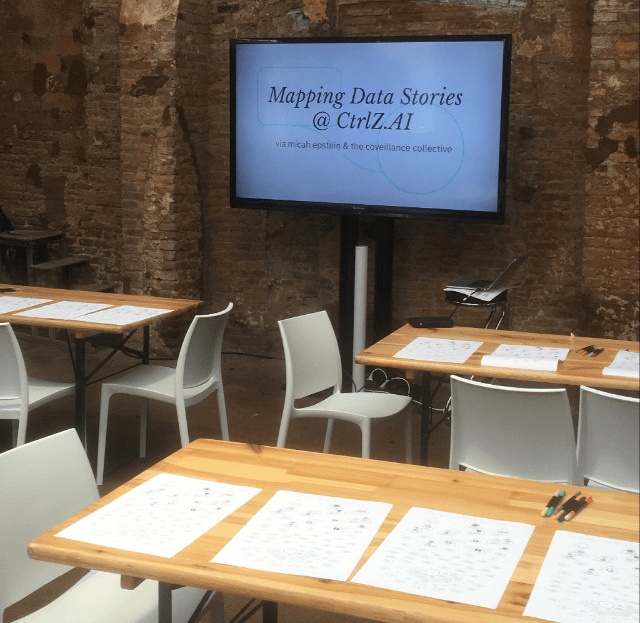
CtrlZ.AI in Barcelona

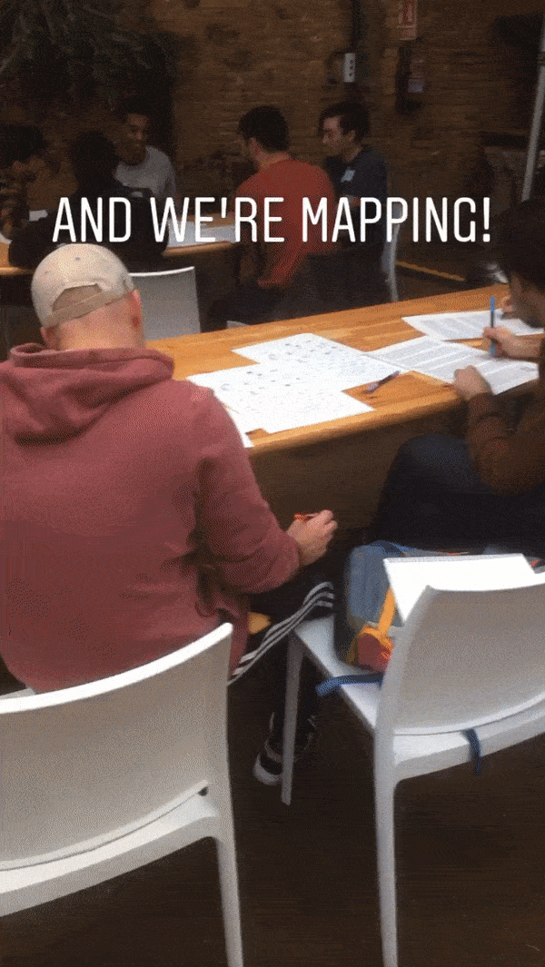


Overall, this was a very successful workshop. Here are some of the factors that I think contributed the most that that:
- ~20 engaged participants: Most of the participants were from the adjacent FAT* conference, and had lots of interesting subject matter knowledge to share. A willingness to volunteer, share insights, and provide feedback made this feel especially productive.
- Setup: Except for a space to pin up the large map, the distribution of the space and materials felt very seamless. We had four tables, with five chairs at each. At each seat was a handout that included a map on one side and the stories on the other. On each table was a wide variety of colored markers. At the front was a large screen for sharing slides.
There, of course, were some things that could be improved on in the next iteration:
- Time: We only had 45 minutes allotted for this workshop, and certain aspects of the workshop certainly felt rushed. I believe it is important to get through the entirety of the demo mapping so that participants have an understanding of the process, but it did eat up more than half of our time. By trying to fit it into less than hour, we lost key time for discussion.
- Space to pin up: The (admittedly beautiful) brick walls of the space meant pinning up the large map was tricky. I ended up taping the top portion of the map onto the TV screen. This made it hard for groups to share out their mapping process with the broader group, and made the final large map feel a little “shaky” and underwhelming.
Online with the Tech Equity Coalition
With the pandemic raging, this was the coveillance collective’s first try at leading a digital workshop. Personally, I think it went very well, and was a great learning experience. Some of the factors that contributed to this are:
- Co-facilitation: We recruited one of our collaborators from the Washington chapter of the Council on American-Islamic Relations to co-lead this workshop. This was especially useful in the Context + Map Overview section. We went back and forth, making it feel more conversational and less like a lecture. We also had awesome members of our collective and the ACLU of Washington to facilitate our break-out rooms, which made for a fluid experience.
- Flexible timing: We had an hour blocked out for this workshop, but with this being a digital workshop I predicted (correctly) that certain aspects would run over. We timed the sections so that all necessary modules would fit into the hour (including having brief dialogues in the breakout groups), and invited participants to stay past the hour for a longer discussion and feedback session. This gave us flexibility and breathing room and allowed our participants to choose their level of involvement based on their schedule.
Of course, there is always things that could be improved on. Some of them include:
- The Act of (Digital) Mapping: No matter how you slice it, Zoom or Google Slides is simply not as intuitive as drawing with a marker. We found that the digital tools were fiddly and time-consuming, and that participants gained a lot more from the categorizing section of the workshop than the mapping. However, the map was still a useful structure and visual element for understanding the categories, so I don’t recommend dropping the map entirely unless you are pressed for time.